Status Page vs Monitoring Dashboard: Why Teams Need Both
When latency spikes hit, engineering sees the graphs, support sees the tickets, but customers just see silence. This guide breaks down the status page vs monitoring dashboard decision, showing why the two tools serve different audiences and why reliability teams need both connected together to close that gap.
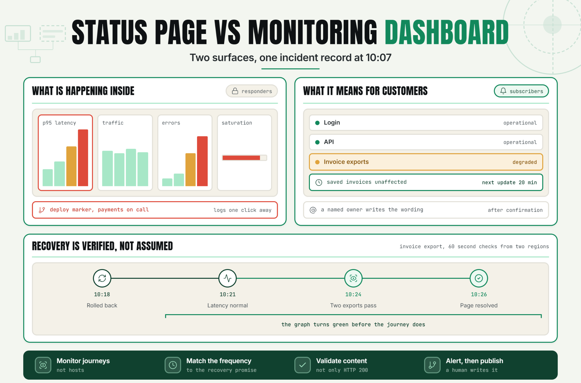
The direct answer is simple. A private monitoring dashboard helps responders detect, diagnose, and fix a problem. A public status page tells customers what is affected, what the team is doing, and when the next update will arrive. Reliability teams need both because operational truth and customer communication are different jobs.
Most teams don’t fail because they lack graphs. They fail because the graph, alert, incident owner, support response, and customer update aren’t connected. That’s the real status page vs monitoring dashboard problem.
The Operational Risk of Using Only One View
The dashboard says the API is healthy, but European customers can’t log in. Or the dashboard correctly shows elevated error rates, yet the public status page stays green for 38 minutes. That’s what weak status page vs monitoring dashboard operations look like in practice: one view has data without context, while the other has messaging without a dependable signal.
The cost isn’t limited to downtime. Uptime Institute’s 2024 annual outage analysis found that 54% of respondents said their most recent significant, serious, or severe outage cost more than $100,000. Sixteen percent put the cost above $1 million. Those figures cover data center outages rather than every SaaS incident, but the lesson travels well: slow recognition, poor routing, and confused communication make already expensive events harder to contain.
Customers don’t care which metric crossed a threshold. They want to know whether their workflow is affected. Engineers need the opposite level of detail. Forcing either audience into the other audience’s view creates noise, delay, and mistrust.
How Status Page vs Monitoring Dashboard Roles Differ
A monitoring dashboard is an internal operational surface. It collects signals, exposes patterns, and gives responders enough detail to move from symptom to likely cause. A status page is an external communication surface. It converts confirmed customer impact into clear service states and timestamped updates.
The simplest status page vs monitoring dashboard comparison is this: the dashboard answers “What is happening inside the system?” The status page answers “What does this mean for customers right now?”
| Dimension | Private monitoring dashboard | Public status page |
|---|---|---|
| Primary audience | SRE, DevOps, engineering, incident command | Customers, support, sales, partners |
| Main purpose | Detect, alert, diagnose, validate recovery | Explain impact, progress, and resolution |
| Data depth | Metrics, logs, traces, regions, dependencies | Service components, incident updates, history |
| Update speed | Seconds or minutes | After impact is confirmed, then on a stated cadence |
| Access | Restricted | Public or subscriber-based |
| Success test | Responders can take the next technical action | Customers understand impact and next update |
What belongs in the private monitoring dashboard
Start with symptoms. Google SRE recommends the four golden signals of latency, traffic, errors, and saturation. For a SaaS application, that might mean p50, p95, and p99 request latency; requests per second; failed login and checkout rates; queue depth; connection-pool use; and database storage headroom.
Then add enough dependency context to diagnose without turning the uptime dashboard into a wall of charts. Show the deployment marker, affected region, endpoint, downstream service, and current on-call owner. Keep raw logs and deep traces one click away. Don’t pin every metric to the main screen.
This is an opinion worth stating plainly: a dashboard nobody can read at 3 a.m. isn’t a dashboard. It’s a data attic.
Thresholds that deserve a page
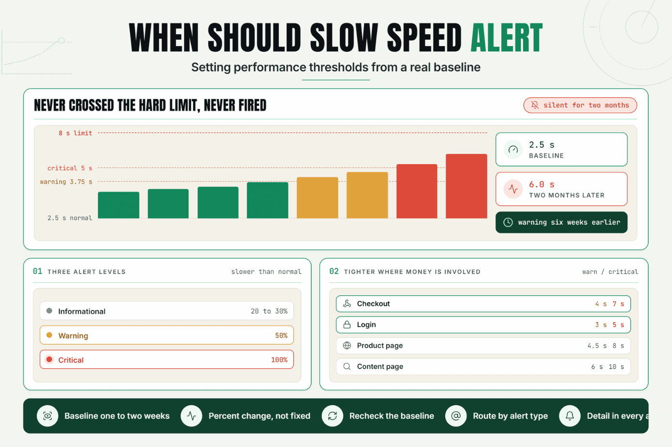
Page on urgent, actionable, user-visible symptoms. Ticket or log the rest. Google SRE warns that frequent pages train people to skim or ignore alerts, which can hide a real outage inside the noise. A practical rule is to alert when a signal breaches a customer-impact threshold for more than one evaluation window or is confirmed from more than one location.
For example, don’t page because CPU reaches 82% for 30 seconds. Page when checkout errors exceed the error-budget threshold for five minutes and a synthetic transaction fails from two regions. CPU can still help diagnose the cause.
What belongs on the public status page
A customer-facing status page should show service components, current state, incident history, scheduled maintenance, and subscription options. The language needs to be specific without exposing secrets. “Checkout failures affecting some customers in Europe” is useful. “Database issue” is usually too vague, and a dump of internal hostnames is far too detailed.
Each incident update needs four things: the affected capability, observed impact, current response phase, and time of the next update. That structure creates incident transparency without pretending the team already knows the root cause.
The Statixoup reliability workflow can serve as the shared starting point for teams mapping internal signals to external components. The link intentionally points to the verified homepage because no deeper public path was available during research.
The handoff between detection and system status
Here’s where status page vs monitoring dashboard planning earns its keep. The monitoring layer should produce a candidate incident with evidence. A human owner should confirm scope, set severity, and publish the first customer update. Automation can carry component state, timestamps, and recovery signals, but it shouldn’t invent an explanation.
Use this five-step process:
- Detect a user-visible symptom.
- Confirm it across a second signal or location.
- Assign an incident owner and map the affected customer component.
- Publish a short impact update with the next-update time.
- Validate recovery from both monitoring and a user-path test before resolving. The result is a single incident record that supports technical response and customer communication.
A Realistic Production Scenario
This is an illustrative example, not a claimed Statixoup customer result.
Imagine a B2B SaaS platform with a web app, authentication service, public API, background-job queue, PostgreSQL database, and third-party payment provider. At 10:07 a.m., a deployment increases database connection use. Login still works, but invoice exports begin timing out.
The first monitoring attempt is weak. A single homepage HTTP check runs every five minutes. It stays green because the marketing site is healthy. Support tickets arrive before the alert.
The improved setup changes the outcome:
- A synthetic invoice-export check runs every minute from two regions.
- The monitor validates the HTTP code, completion time, and expected file response.
- A p95 latency alert opens only after three failed evaluation windows.
- Database connection saturation and queue depth appear beside the symptom.
- The alert routes to the payments on-call owner and incident channel.
- The public component “Invoice exports” changes to degraded after confirmation.
- The first update says exports may time out, saved invoices are unaffected, and the next update will arrive in 20 minutes.
| Monitor | Check frequency | Failure rule | Route | Public component |
|---|---|---|---|---|
| Web login | 60 seconds | 2 regions fail twice | Identity on-call | Login |
| Public API | 30 seconds | Error rate or p95 breaches SLO | API on-call | API |
| Invoice export | 60 seconds | 3 consecutive failed transactions | Payments on-call | Invoice exports |
| Background queue | 60 seconds | Depth and oldest-job age exceed threshold | Platform on-call | Processing |
| TLS certificate | Daily | Fewer than 21 days remaining | Platform ticket | No automatic incident |
At 10:18 a.m., engineering rolls back the deployment. At 10:21, internal latency returns to normal. The team doesn’t close the incident yet. Two successful synthetic exports from each region confirm recovery at 10:24, and the public status page is resolved at 10:26 with a short final note.
That six-minute validation gap matters. A dashboard can look healthy before a customer journey is genuinely restored.
Teams can use the Statixoup product homepage as the internal review point when translating this model into their own component map and monitor inventory.
Best Practices for Reliable Coverage
Monitor customer journeys, not just hosts
Check login, search, checkout, exports, and API calls because customers experience workflows, not server health. Keep infrastructure metrics nearby for diagnosis, but let customer symptoms drive paging.
Match frequency to the recovery promise
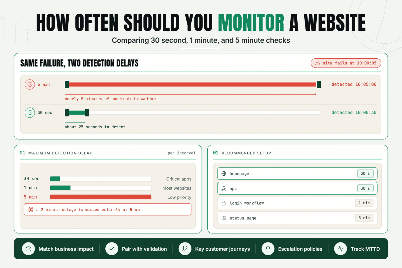
A five-minute check can’t reliably support a two-minute detection target. High-volume revenue paths may need 30 to 60-second checks. Certificate expiry can run daily. The right frequency reflects how quickly a missed failure would consume the service objective.
Validate content, not only HTTP 200
A broken login page can return 200 with an error message. Check a known response field, redirect, keyword, or synthetic transaction outcome. That catches partial failures that shallow uptime checks miss.
Give every signal an owner and route
An alert without an owner is a delayed incident. Map each monitor to a team, escalation policy, runbook, and public component before production launch. Review the map after architecture changes.
Separate alerting from publishing
Let confirmed monitoring data prepare the incident, but keep a named human accountable for customer wording. This protects incident transparency when the initial cause is still uncertain.
The Statixoup monitoring and communication entry point is the verified internal destination for evaluating that shared workflow.
Common Mistakes
Treating the homepage check as full coverage
Why it happens: it’s quick to configure and easy to understand. Why it fails: authentication, payments, APIs, and queues can break while the homepage stays green. Add one monitor for every critical customer journey and dependency boundary.
Publishing every alert automatically
Why it happens: teams want instant incident transparency. Why it fails: one noisy region or bad threshold can create a false public outage. Require corroboration and an incident owner for impact wording.
Using averages for latency
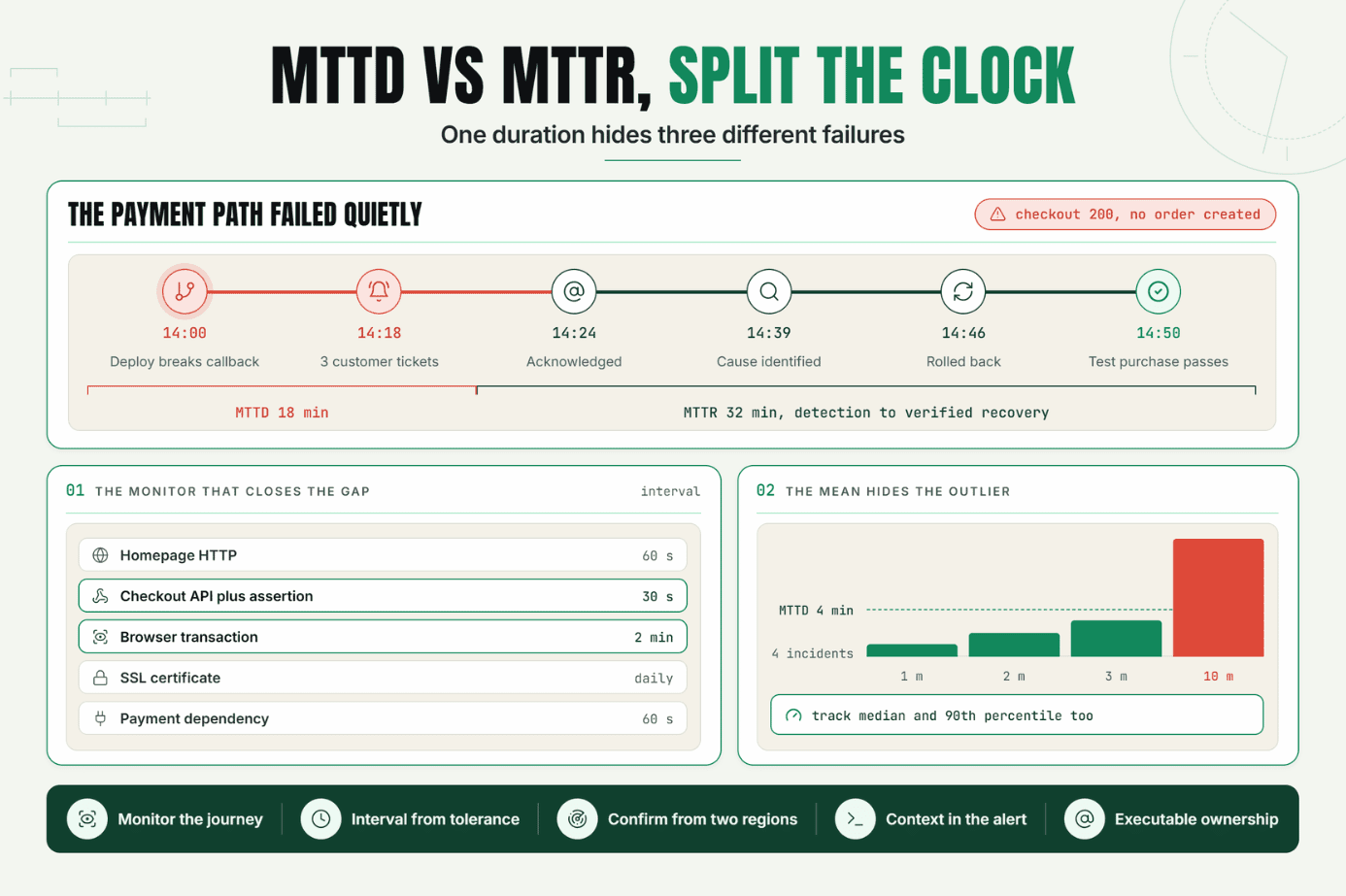
Why it happens: averages fit neatly on a single tile. Why it fails: a slow tail can hurt a meaningful slice of customers while the mean looks normal. Track p95 or p99 latency for critical paths. Google SRE gives a useful example: at 1,000 requests per second with 100 ms average latency, 1% of requests could still take five seconds.
Hiding dependencies from the incident view
Why it happens: ownership is split across teams. Why it fails: responders see the symptom but lose time discovering that identity, a database, or a third-party API is involved. Map dependencies to the same incident record without exposing sensitive internal detail publicly.
Closing when the graph turns green
Why it happens: responders want to end the incident quickly. Why it fails: metrics can recover before queued jobs drain or user sessions work again. Validate the actual customer journey, then resolve the system status update.
Conclusion
The status page vs monitoring dashboard choice is a false choice. One surface helps your team understand the system; the other helps customers understand the incident. Reliability improves when detection, ownership, diagnosis, communication, and recovery validation share the same workflow.
Start with one action: map your five most important customer journeys to internal monitors and public components. Gaps become obvious fast.
Start a 7-Day Statixoup Trial
Start a 7-day Statixoup trial and configure one critical journey end to end. Set the check, threshold, owner, escalation route, public component, update cadence, and recovery test. Then run a short incident exercise before the next real outage makes the decision for you.
Post a Comment

Hardik Vaghani
Hardik Vaghani is a Digital Marketing Professional and SEO Strategist based in Surat, Gujarat, India. He currently works with Ethnic Infotech, contributing to SEO, content marketing, technical SEO, and digital growth strategies. Hardik also creates blog content for Fusion5, focusing on technology, laptops, and consumer electronics. With expertise in SEO, Google Ads, Meta Ads, Local SEO, and Content Strategy, he helps businesses improve online visibility, rankings, and lead generation through data-driven marketing.
Frequently Asked Questions
Related Blogs